Who hasn’t found themselves caught up in a lively Sunday lunch debate about current events or everyday topics, where bold opinions are shared but no one has the numbers to back them up? Throughout the year, we’ll be diving into questions that almost everyone has asked themselves at some point, using data visualizations based on open and publicly available data. Perfect for anyone who wants to take the conversation further than the Sunday table.
Today, we’re taking a closer look at Eurovision.

These articles will also be an opportunity to highlight key best practices from our exclusive Dashboard Design methodology and to flag some common pitfalls to avoid. The goal is to ensure the most effective analysis possible and to reduce the risk of bias when answering the questions we’re tackling.
As almost every fan of music, television, Europe, or all three knows, the 2024 Eurovision Song Contest took place on Saturday, May 11.

Not being an expert on the event myself, I took a closer look at the voting system used to determine the winner. To put it simply, each country awards between 1 and 12 points to the countries of its choice. That’s when a question came to mind: is Eurovision really just a contest based purely on musical talent, or do international relations and current events influence the outcome?
To explore this, I set out to find open data sources that could help shed light on the issue, using data visualization as a key tool.
Interpreting the Data to better understand the challenge
Before creating a dashboard, it’s always important to take a step back and understand the real need and the context behind it. What are we trying to achieve with this dashboard? Why do we need this data to guide our decisions? These are the kinds of questions that help ensure we’re building something truly useful.
We could go on with even more questions, using for instance the well-known “5 Whys” method. The key takeaway here is the importance of what’s often called the needs assessment phase. It’s a step that should never be overlooked.
Beyond the essential business knowledge, having a good grasp of the available data and the indicators that can be derived from it is also a real asset. One useful approach to building that understanding is to use data visualization. It provides clear, descriptive insights that can help spark initial questions and make it easier to define the real need. In our case, a simple starting point could be to display the countries with the most Eurovision wins.
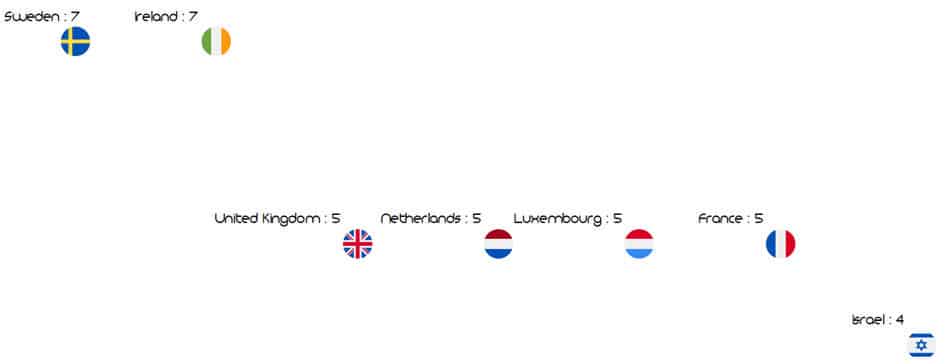
At this little game, Sweden and Ireland come out on top, with seven wins each!
Choosing the right visual to answer the right question
One of the key objectives behind this dashboard was to explore how relationships between countries might influence voting patterns. The first type of relationship that comes to mind is, of course, geographic proximity. While not all neighboring countries have strong ties, it’s a logical starting point for analysis and can help begin to answer our initial question.
To sum up this line of analysis and apply it to our dataset, the core question becomes: who votes for whom?
Simplifying the question this way helps identify its underlying function, whether it’s about comparison, hierarchy, location, or distribution. These functions are what guide the choice of the most appropriate visual to deliver a clear and unbiased message. Of course, there’s rarely a single “right” chart. Several types can work, but narrowing down the options is always helpful. The next step is to ensure the visual is easy to read, for example by limiting the number of colors, removing distracting gridlines, or simplifying labels that may affect readability.
So, Sweden has won Eurovision seven times, but which countries are actually voting for Sweden?
I chose to use the simplest possible maps to answer this question.
- In blue: the country we’re focusing on
- One bubble per country that has awarded points, with size and color increasing based on the total number of points given since 1956
- Value labels for the three countries that have given the most points
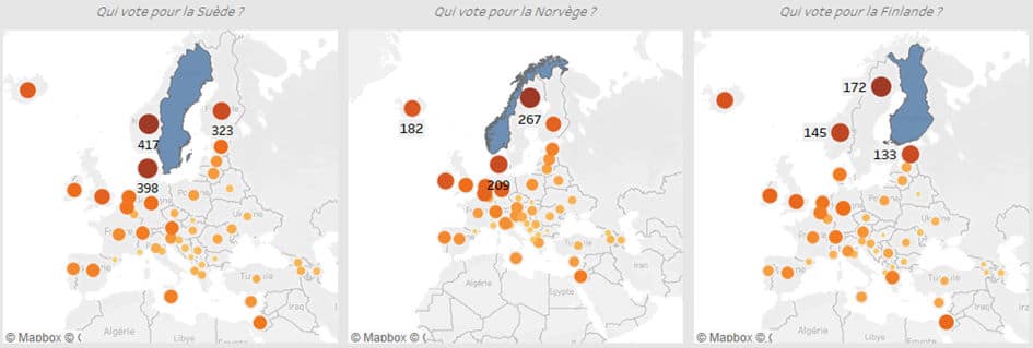
The example of the Nordic countries (Sweden, Norway, Finland, Denmark, Iceland) shows that nations with a shared cultural background tend to vote for one another. Having a large number of neighboring countries with strong ties can clearly be an advantage when it comes to winning the contest.
In the dashboard available at the end of the article, you’ll find a visualization that lets you select a target country and explore other similar patterns, such as Ireland and the United Kingdom, or Cyprus and Greece.
Data visualization to raise questions, not just provide answers
Beyond relationships between countries, current events can also play a role in the final outcome. In 2022, following the start of Russia’s invasion, it’s hard not to interpret Ukraine’s victory as a message of support from several European countries.
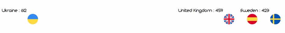
That year, Ukraine won by a wide margin ahead of the other top contenders, though this in no way calls into question the talent of the group representing the country.
Our initial question is, by nature, a complex one, and it’s impossible to precisely measure the role geopolitics may have played in the final results. The goal here is to provide some insights through visualization, and potentially raise new questions that could be explored further using the available data.
This situation can easily be applied to professional contexts. It’s important not to see data visualization or dashboards as simple answers to our questions. They are tools that support decision-making, but also reflection and critical thinking. They are meant to complement human intelligence as we move forward and take action.
Check back in a few weeks for a new article exploring the Parisian summer ahead…
In the meantime, feel free to reach out if you’d like to discuss Dashboard Design with us 😊


Comments (0)
Your email address is only used by Business & Decision, the controller, to process your request and to send any Business & Decision communication related to your request only. Learn more about managing your data and your rights.